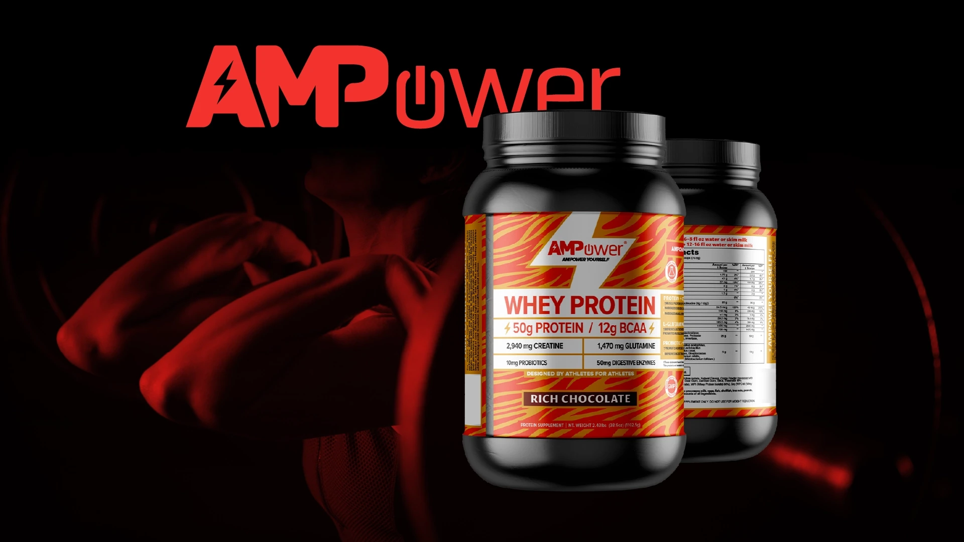
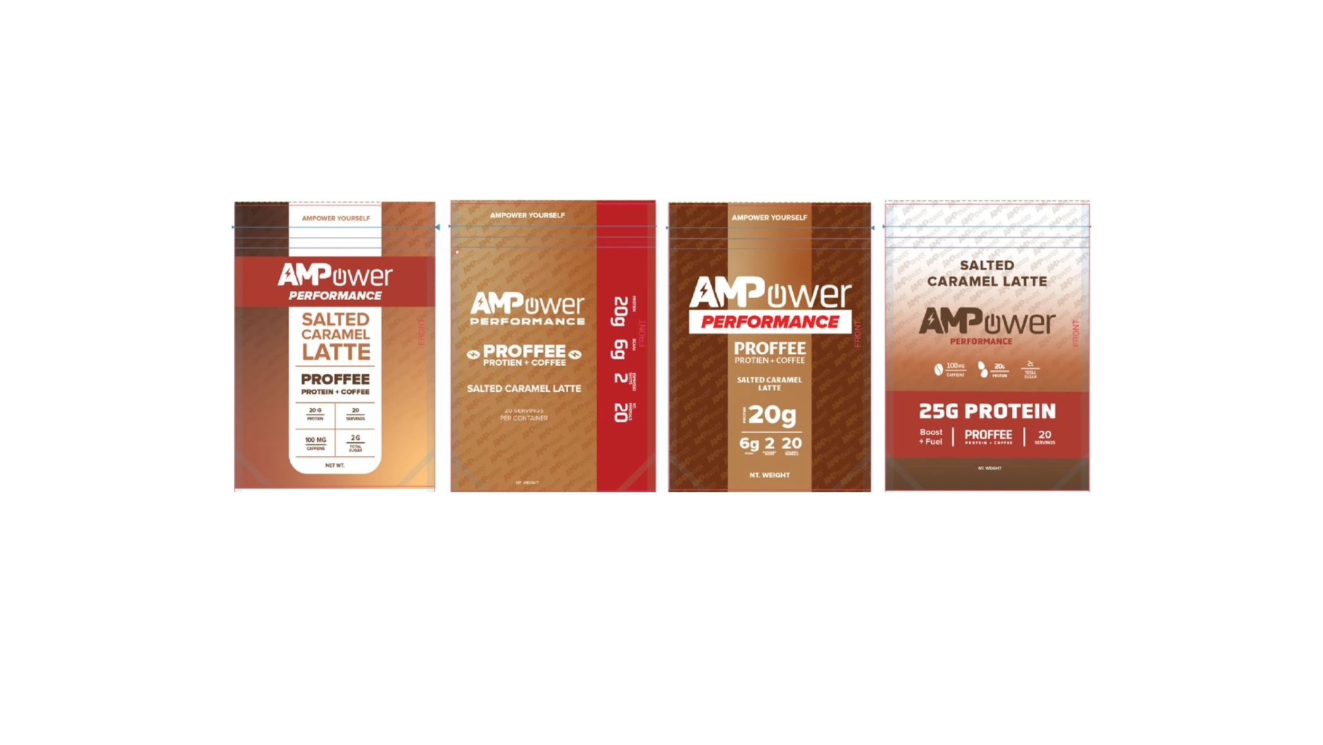
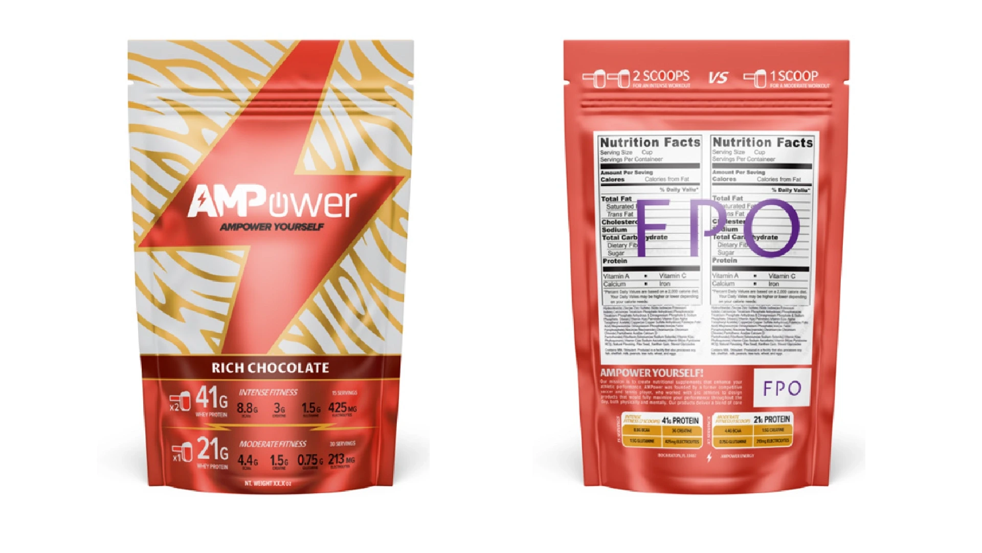
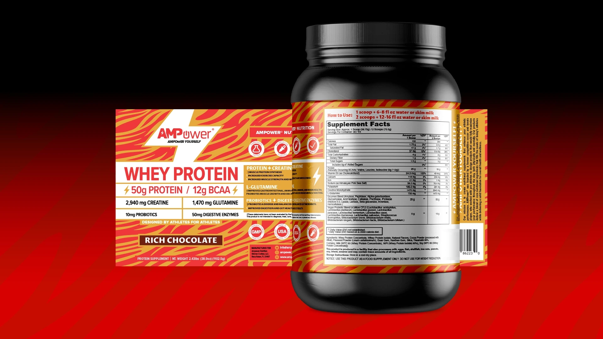
Many conversations took place to nail down the hierarchy of the information included in the design. As concepts were presented, packaging options were explored, and designs needed to be flexible enough to accommodate changing formats.
A color system was put in place early on to highlight the difference between protein powders designed for pre or post workout usage. When combined with the energy of our tiger-tripe inspired patterns, and metallic treatment to the gold colors, we were able to arrive at a design that demonstrates the kind of performance boost users can expect when they combine their workouts with this unique protein blend.